border属性在CSS3新增了很多样式,比如border-radius圆角样式,其中可以为border-color设置transparent值则实现了利用该样式绘制三角形等的能力。
transparent表示透明,透明不代表不存在。
在CSS2里面,只能为background-color设置该值,在CSS3里,只要能设置颜色的地方都可以使用。
一、绘制一个三角形
HTML结构如下:
<div class="b1"></div>
先设置基础样式,如下:
.b1{
width:100px;
height:100px;
background-color:#eee;
border:20px solid #0BA61B;
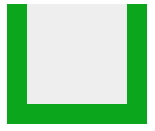
border-top:none;}你会发现,当top的边框没有的时候,上面是齐平的,如图:
继续设置样式,把左右两边的边框颜色设置为transparent。
.b1{
width:100px;
height:100px;
background-color:#eee;
border-left:20px solid transparent;
border-right:20px solid transparent;
border-bottom:20px solid #0BA61B;
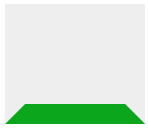
}这时候发现颜色为透明的边框和另一个有颜色的边框交界处是斜线,而不是齐平的线条。效果如图所示:
此时,只需要设置容器的宽高为0,清除背景色,就可以了。
.b1{
	width:0;
	height:0;
	border-left:20px solid transparent;
	border-right:20px solid transparent;
	border-bottom:20px solid #0BA61B;
	}
效果如图所示:

你还可以根据需要修改边框的值,如果把左右边框的值设置为底部边框的一半:
.b1{
	width:0;
	height:0;
	border-left:10px solid transparent;
	border-right:10px solid transparent;
	border-bottom:20px solid #0BA61B;
	}
效果如图所示:

反过来,可以设置一条边的透明值:
.b1{
	width:0;
	height:0;
	border-top:20px solid #0BA61B;
	border-bottom:20px solid #0BA61B;
	border-left:20px solid transparent;
	}
则效果如图所示:

还可以两条边没有,一条边透明,一条边有颜色:
.b1{
	width:0;
	height:0;
	border-right:20px solid transparent;
	border-bottom:20px solid #0BA61B;
	}
效果如图所示:

可以自己多多实验不同的搭配^_^
二、结合:before和:after伪元素实现特别的面包屑导航
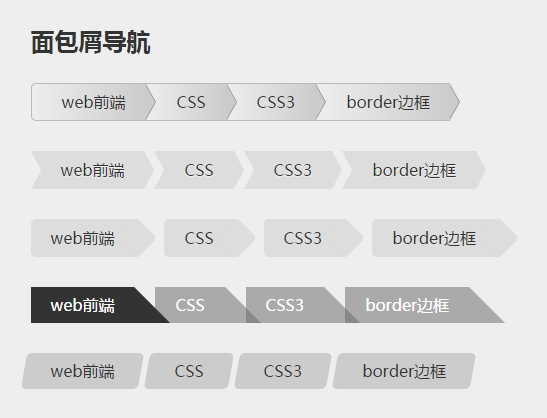
1、HTML结构
因为结构都是一样的,所以只列出其中一个,非常简单的列表。
<ul id="breadcrumb3" class="clearfix">
      <li><a href="#" id="current">web前端</a></li>
      <li><a href="#">CSS</a></li>
      <li><a href="#">CSS3</a></li>
      <li><a href="#">border边框</a></li>
</ul>
2、CSS样式
#breadcrumb li{
	float:left;
	}
#breadcrumb li a{
	display:block;
	position:relative;
	height:36px;
	line-height:36px;
	background-color:#ccc;
	padding:0 20px 0 30px;
	border:1px solid #bbb;
	border-right:none;
	color:#333;
	text-decoration:none;
	background-image: -webkit-gradient(linear, left top, right bottom, from(#eee), to(#ccc));
	background-image: -webkit-linear-gradient(left, #eee, #ccc);
	background-image: -moz-linear-gradient(left, #eee, #ccc);
	background-image: -ms-linear-gradient(left, #eee, #ccc);
	background-image: -o-linear-gradient(left, #eee, #ccc);
	background-image:linear-gradient(to right,#eee,#ccc);/*线性渐变*/}
#breadcrumb li:first-child a{
	-webkit-border-radius:5px 0 0 5px;
	-moz-border-radius:5px 0 0 5px;
	border-radius:5px 0 0 5px;}
#breadcrumb li a:after,#breadcrumb li a:before{
	content:"";
	position:absolute;
	right:-10px;
	bottom:0;
	z-index:10;
	border-left:10px solid #ccc;
	border-top:18px solid transparent;
	border-bottom:18px solid transparent;
	}
#breadcrumb li a:before{
	border-left-color:#999;
	right:-11px;
	z-index:9;}
#breadcrumb li:last-child a:after{
	right:-9px;/*最后一个li的a:after的right边距往右移9px*/
	}
#breadcrumb li:last-child a:before{
	right:-10px;}

#breadcrumb li a:hover{
	color:#400000;
	background-color:#eee;
	background-image:none;
}
#breadcrumb li a:hover:after{
	border-left-color:#eee;}


/*--------------------------------------------*/
/*第二个面包屑导航样式*/
#breadcrumb1 li{
	float:left;
	margin:0 10px;}
#breadcrumb1 li a{
	position:relative;
	display:block;
	padding:0 20px;
	line-height:38px;
	text-align:center;
	background-color:#ddd;
	text-shadow:0 1px 0 rgba(255,255,255,.5);
	}
#breadcrumb1 li a:hover{
	background-color:#62B31A;}
#breadcrumb1 li a:before{
	content:"";
	position:absolute;/*必须是apdiv类的定位,否则默认有高度。*/
	border-left:10px solid transparent;
	border-top:19px solid #ddd;
	border-bottom:19px solid #ddd;
	top:0;
	left:-10px;
	}
#breadcrumb1 li a:hover:before{
	border-color:#62B31A #62B31A #62B31A transparent;}
#breadcrumb1 li a:after{
	content:"";
	position:absolute;
	right:-10px;
	top:0;
	border-top:19px solid transparent;
	border-bottom:19px solid transparent;
	border-left:10px solid #ddd;}
#breadcrumb1 li a:hover:after{
	border-color:transparent #62B31A transparent #62B31A;}
/*--------------------------------------------*/
#breadcrumb2 li{
	float:left;
	margin:0 30px 0 0;}
#breadcrumb2 li a{
	position:relative;
	display:block;
	line-height:38px;
	padding:0 20px;
	background-color:#ddd;
	-webkit-border-radius:5px 0 0 5px;
	-moz-border-radius:5px 0 0 5px;
	border-radius:5px 0 0 5px;}
#breadcrumb2 li a:after{
	content:"";
	position:absolute;
	width:30px;
	height:30px;
	top:4px;
	right:-17px;
	-webkit-border-radius:5px;
	-moz-border-radius:5px;
	border-radius:5px;
	background-color:#ddd;
	-webkit-transform:rotate(45deg);
	-moz-transform:rotate(45deg);
	transform:rotate(45deg);/*顺时针旋转45度*/
	}
#breadcrumb2 li a:hover,#breadcrumb2 li a:hover:after{
	background-color:#6AE4E8;}
/*--------------------------------------------*/
#breadcrumb3 li{
	float:left;
	margin-right:-15px;}
#breadcrumb3 li a{
	position:relative;
	display:block;
	padding:0 20px;
	color:#fff;
	border-right:36px solid transparent;
	border-bottom:36px solid rgba(102,102,102,.5);
	height:0;/*让文字在边框上*/
	line-height:36px;/*在边框里纵向居中*/
	}
#breadcrumb3 li a:hover{
	border-bottom-color:rgba(36,196,230,.7);}
#breadcrumb3 li a#current{
	border-bottom-color:#333;
	z-index:2;/*层级上升,可以压住旁边的对象*/
	}
/*--------------------------------------------*/
#breadcrumb4 li{
	float:left;
	margin-right:20px;}
#breadcrumb4 li a{
	display:block;
	line-height:36px;
	padding:0 20px;
	position:relative;
	background-color:#ccc;}
#breadcrumb4 li a:before,#breadcrumb4 li a:after{
	content:"";
	position:absolute;
	width:14px;
	height:36px;
	left:-7px;
	bottom:0;
	background-color:#ccc;
	-webkit-border-radius:5px 0 0 5px;
	-moz-border-radius:5px 0 0 5px;
	border-radius:5px 0 0 5px;
	-webkit-transform:skew(-10deg);
	-moz-transform:skew(-10deg);
	-ms-transform:skew(-10deg);
	transform:skew(-10deg);/*逆时针旋转10度*/
	}
#breadcrumb4 li a:after{
	border-radius:0 5px 5px 0;
	left:auto;
	right:-7px;
	}
#breadcrumb4 li a:hover,#breadcrumb4 li a:hover:after,#breadcrumb4 li a:hover:before{
	background-color:#E9E043;}
/*#breadcrumb4 li a#current1:before,#breadcrumb4 li a#current1:after{
	content:normal;}*/
	/*如果不需要:after等伪元素的内容,可以把content设置为normal*/
该案例需要对伪元素知识点和相对绝对定位有了解才能轻松搞定哦,还有一点变形效果(transform)是额外内容。
如果有疑问,欢迎给我留言,或者QQ交流。
发表评论:
◎请发表你卖萌撒娇或一针见血的评论,严禁小广告。